에코브릿지가 UX/UI를 진행한 Hansot Order App이 런칭되었습니다.
Hansot Order UXUI eXperience Design 보러가기
–
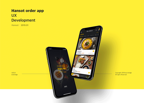
Hansot order app
UX Development
UX Development
Hansot l 2019.01 l UI/GUI
–
App Research & Analysis
Apply tiled groupings and use the same color tone.
Emphasize product recognition and use effective interaction.
Flat design, card-based layout, color with strong contrast, large typeface, interaction, and transits consistent brand experience offline.
–
Trends in reactive web design, flat design, and mechanical design were all ways to make users experience the same thing in any environment.
These methods provide consistent identity regardless of device or browser, resulting in users experiencing the same experience on the web or mobile.
The trend is also in mobile apps, named Omni Channel.
When customers receive the same service on-off line over Omni Channel,
Consistent design and the provision of experience (UX) should be utilized as a more important factor for the convenience of customers.
–
Image KEYWORD
Yellow.Orange.Red. + Familiar + Classy
–
DESIGN DIRECTION
Utilize tile form.
Use of the same color tone for component elements.
Emphasize product recognition rather than text.
Provide the same experience as offline
Use of the same color tone for component elements.
Emphasize product recognition rather than text.
Provide the same experience as offline
Use Yellow, Orange, Red.
Utilize the Components & Icons of
a Circular Shoe a friendly tone
Direct store color tone & refinement emphasis.
Utilize the Components & Icons of
a Circular Shoe a friendly tone
Direct store color tone & refinement emphasis.
–
DESIGN Concept
” Urban Life ‘ – the sophisticated life of living in the city.
–
Review
“Hanpot Doshirak” is a good company that has developed from its basic brand experience of “good price.”
We wanted to capture the brand’s direction of ‘good price and luxurious’ in the entire design tone.
And I wanted to convey my look UX experience, even though I could easily order it if I followed the brand color Yellow Color.
Although it took a long time to open the project, it seems that the decision was made from the client to UI&GUI.
Thank you all for your hard work.